
People or clients often ask a very simple question:
“I want a good website.”
At first glance, this sounds straightforward. But when you dig deeper, you quickly realize there is no single, simple answer.
Very often, clients will also say something like:
“I want my website to look like this one.”
(Then they send a URL as a reference.)
But when asked why that reference site is good, or what exactly makes it good, the answer usually becomes unclear. They like it—but they can’t fully explain it. Is it the layout? The colors? The images? The feeling? Or just the fact that it “looks professional”?
This confusion is extremely common, and it’s exactly why many websites end up looking “okay,” but not great.
In this article, we’ll break down what really makes a good website, explain why two websites using the same platform or theme can look completely different, and show what truly determines whether a website looks premium, professional, and effective.
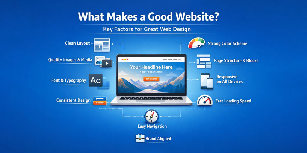
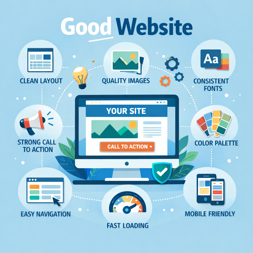
1. There Is No Single Definition of a “Good Website”
A good website is not defined by just one thing.
It is not:
Just the platform (WordPress, Shopify, Wix, etc.)
Just the theme or template
Just modern design trends
Just expensive plugins
A good website is the result of many elements working together—visually, structurally, and strategically.
Only when these elements are aligned does a website feel polished, trustworthy, and enjoyable to use.
2. Most Websites Are Built on the Same Platforms
Today, the majority of websites are built on a few major platforms, such as:
WordPress
Shopify
GoDaddy
Wix
Squarespace
These platforms are powerful, flexible, and widely used. However, they all rely heavily on predesigned themes or templates.
This leads many people to believe:
“If I choose a good theme, I will automatically have a good website.”
But in reality, this is only the starting point.
3. Why the Same Theme Can Produce Very Different Results
You may have noticed this before:
Two websites use the same theme or template, yet:
One looks clean, premium, and professional
The other looks messy, outdated, or cheap
Why does this happen?
Because a theme does not decide how good a website looks—how it is used does.
A theme is just a framework. What truly determines the final result are the elements and assets placed inside it.
4. Visual Assets: Images and Videos Matter More Than People Think
One of the biggest factors in how a website looks is the quality and consistency of its visual assets.
This includes:
Images
Videos
Backgrounds
Icons
Graphics
Key questions to ask:
Are the images high-resolution?
Are they consistent in style?
Do they share similar color tones and saturation?
Are image sizes and ratios consistent?
Are images properly cropped and aligned?
Even the best layout will look poor if the images are:
Blurry
Pixelated
Random stock photos with different styles
Poorly cropped or stretched
A good website uses coordinated visuals that feel intentional, not accidental.
5. Typography: Fonts, Sizes, and Readability
Typography is another area that quietly makes or breaks a website.
Many people underestimate how important text styling is, but in reality:
Bad typography can ruin an otherwise good design.
Key typography factors include:
Font choice
Font size
Line height
Text color
Consistency across pages
A good practice is to:
Use 2–3 fonts at most
Keep heading styles consistent
Avoid font sizes that are too large or too small
Ensure text color contrasts well with the background
When fonts are inconsistent or poorly sized, a website immediately feels unprofessional—even if the colors and images are good.
6. Color Usage: Control Is More Important Than Creativity
Good websites don’t necessarily use many colors.
In fact, too many colors often make a website look chaotic.
A strong website usually has:
One main brand color
One or two accent colors
Neutral colors (white, gray, black)
More importantly, colors should be:
Consistent across the site
Used intentionally
Matched with images and text
When color usage is uncontrolled, even a well-designed theme can feel messy and overwhelming.
7. Page Structure: Blocks and Sections
Each section on a webpage is essentially a block.
These blocks can include:
Hero sections
Text sections
Image galleries
Call-to-action areas
Testimonials
Feature grids
Modern tools like Elementor and similar page builders allow developers to:
Use predesigned blocks
Customize layouts easily
Maintain consistent spacing and alignment
While these blocks may look advanced, they are fundamentally built on basic HTML and CSS. There is nothing that cannot be recreated or customized with the right approach.
This means:
Any layout you see on a reference website can be achieved—if it’s structured properly.
8. Learning from Reference Websites (The Right Way)
When clients say, “I want my site to look like this one,” the goal should not be copying blindly.
Instead, we analyze:
Layout structure
Spacing between sections
Content hierarchy
Use of images vs text
How calls to action are placed
A good website borrows design logic, not just surface appearance.
9. Consistency Is the Silent Hero
One of the most important yet overlooked factors is consistency.
This includes:
Button styles
Font usage
Spacing rules
Icon styles
Image treatment
Inconsistent design elements instantly make a website feel unfinished—even if each part looks good on its own.
10. A Good Website Is Not Just “Good-Looking”
While appearance is crucial, a truly good website also:
Loads fast
Works well on mobile
Is easy to navigate
Clearly communicates its purpose
If users feel confused or overwhelmed, the design has failed—no matter how beautiful it looks.
11. How Bel Oak Marketing Helps
At Bel Oak Marketing, we understand that a good website is not about:
Using the most expensive theme
Copying trendy designs
Adding unnecessary animations
It’s about:
Understanding what you like and why
Studying reference websites properly
Selecting the right layout structure
Using high-quality visual assets
Maintaining consistency across every page
Whether you want a website that feels minimal, premium, bold, or conversion-focused, we help customize your website to match your vision—or your reference site—correctly and effectively.
12. A Good Website Is Not Created By Accident
A good website is not created by accident.
It is the result of:
Thoughtful layout
Strong visual assets
Clean typography
Controlled colors
Structured blocks
Consistent execution
Once you understand these fundamentals, you’ll never look at websites the same way again—and you’ll finally know why some websites look great while others don’t.
If you’re ready to build a website that truly reflects your brand and goals, the process starts with understanding what “good” really means.
For more information, visit Bel Oak Marketing.